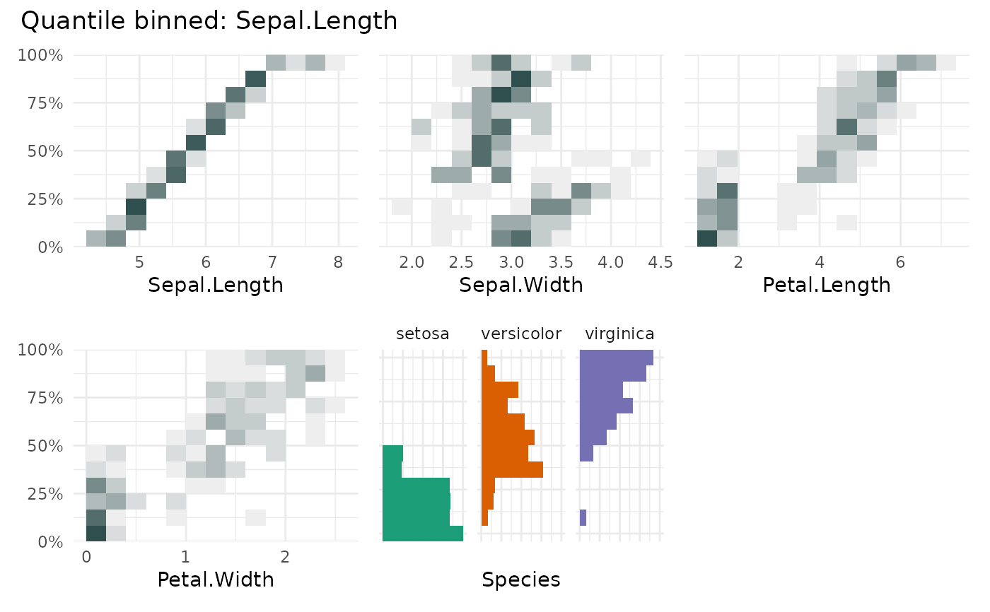
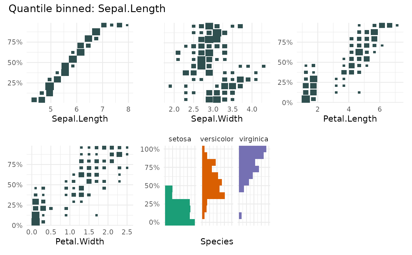
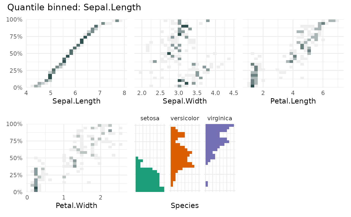
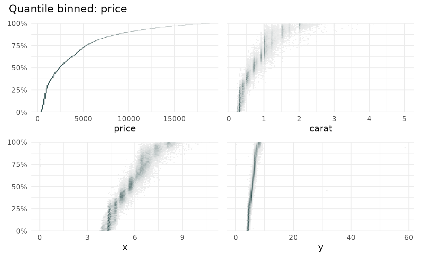
qbin_heatmap shows the distribution of the y
of variables for each quantile bin of x. It is an alternative to
qbin_boxplot(), fine graining the distribution per qbin().
qbin_barplot() highlights the median/mean of the quantile bins, while
Arguments
- data
a
data.frameto be binned- x
charactervariable name used for the quantile binning- n
integernumber of quantile bins.- min_bin_size
integerminimum number of rows/data points that should be in a quantile bin. If NULL it is initiallysqrt(nrow(data))- overlap
logicalifTRUEthe quantile bins will overlap. Default value will beFALSE.- bins
integervector with the number of bins to use for the x and y axis.- type
The type of heatmap to use. Either "gradient" or "size".
- ncols
The number of column to be used in the layout.
- auto_fill
If
TRUE, use a different color for each category.- fill
The color used for categorical variables.
- low
The color used for low values in the heatmap.
- high
The color used for high values in the heatmap.
- ...
Additional arguments to pass to the plot functions
Value
A list of ggplot objects.
See also
Other qbin plotting functions:
qbin_barplot(),
qbin_boxplot(),
qbin_lineplot()
Examples
# \donttest{
qbin_heatmap(
iris,
"Sepal.Length",
auto_fill = TRUE
)
#> `overlap` not specified, using `overlap=FALSE`
#> `min_bin_size`=12, using `n=12`
 qbin_heatmap(
iris,
"Sepal.Length",
auto_fill = TRUE,
type = "size"
)
#> `overlap` not specified, using `overlap=FALSE`
#> `min_bin_size`=12, using `n=12`
qbin_heatmap(
iris,
"Sepal.Length",
auto_fill = TRUE,
type = "size"
)
#> `overlap` not specified, using `overlap=FALSE`
#> `min_bin_size`=12, using `n=12`
 qbin_heatmap(
iris,
"Sepal.Length",
overlap = TRUE,
auto_fill = TRUE
)
qbin_heatmap(
iris,
"Sepal.Length",
overlap = TRUE,
auto_fill = TRUE
)
 data("diamonds", package="ggplot2")
qbin_heatmap(
diamonds[c(1,7:9)],
x = "price",
n = 150
)
data("diamonds", package="ggplot2")
qbin_heatmap(
diamonds[c(1,7:9)],
x = "price",
n = 150
)
 # }
# }