This package creates plots using quantile binning. Quantile binning is an exploratory data analysis tool that helps to see the distribution of the variables in a dataset as a function of the variable that is binned.
Installation
You can install the released version of qbinplots from CRAN with:
install.packages("qbinplots")You can install the development version of qbinplots from GitHub with:
remotes::install_github("edwindj/qbinplots")Example
A quantile binning boxplot
qbin_boxplot(iris, "Sepal.Length", n = 12)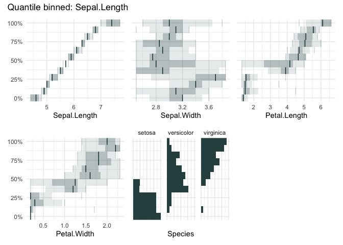
vs
A quantile binning barplot
qbin_barplot(iris, "Sepal.Length", n = 12)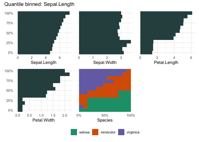
table_plot(iris, "Sepal.Length", n=12)
vs
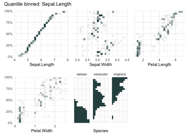
A quantile binning heatmap
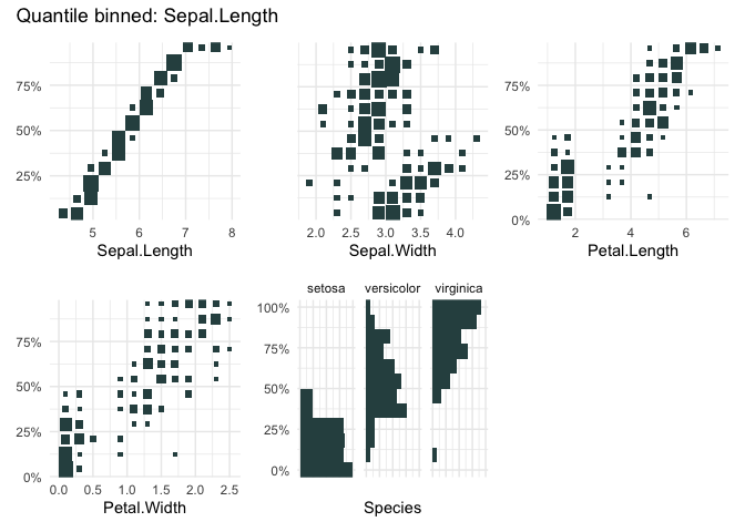
qbin_heatmap(iris, "Sepal.Length", n=12, auto_fill = TRUE)
cond_boxplot(iris, "Sepal.Length", n=12, auto_fill = TRUE)
cond_barplot(iris, "Sepal.Length", n=12, auto_fill = TRUE)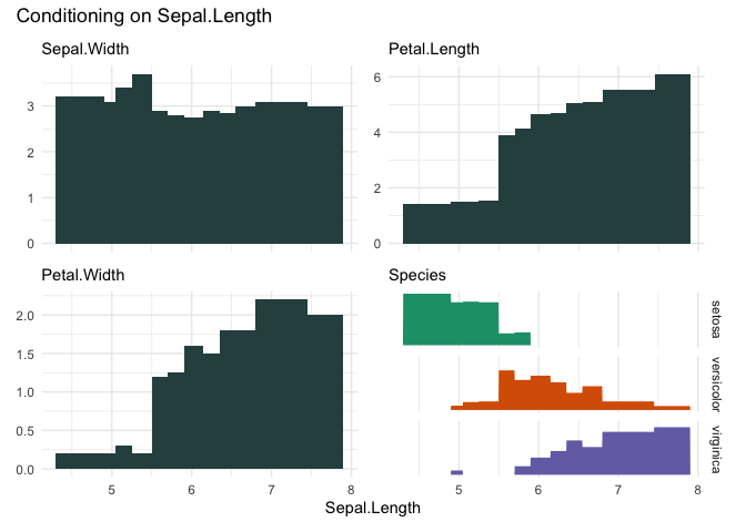
funq_plot(iris, "Sepal.Length", 12, auto_fill = TRUE)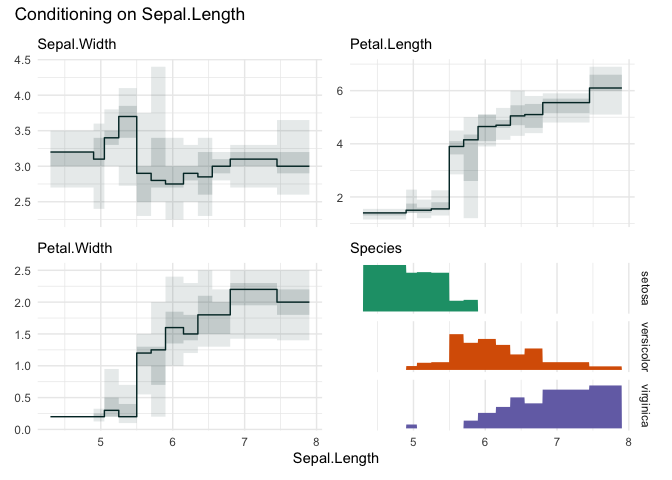
funq_plot(iris, "Sepal.Length", overlap = TRUE, min_bin_size = 20)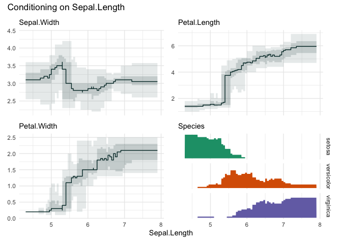
Choosing “Petal.Width”
funq_plot(iris, "Petal.Width", n=12)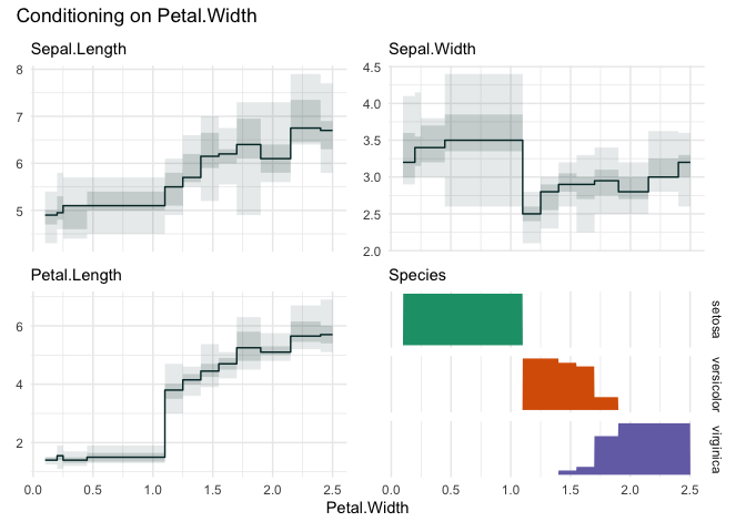
library(palmerpenguins)
qbin_lineplot(penguins[1:7], x="body_mass_g", n = 19, ncols = 4)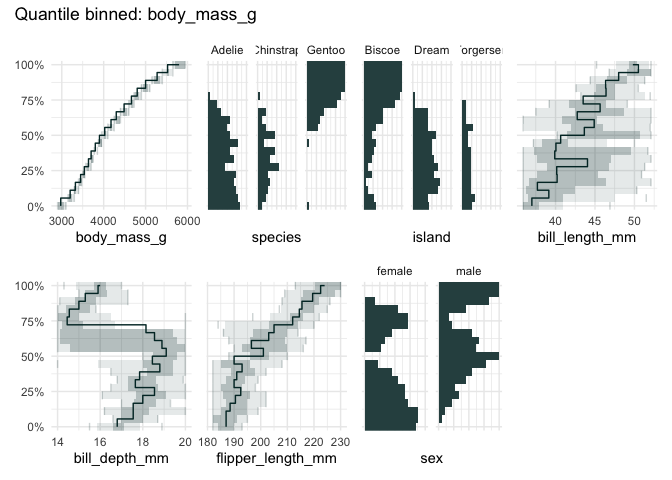
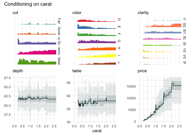
Or the well-known diamonds dataset
data("diamonds", package = "ggplot2")
diam <- diamonds |>
  subset(
    select = c(carat, price, cut, color, clarity)
  )
table_plot(diam, "carat")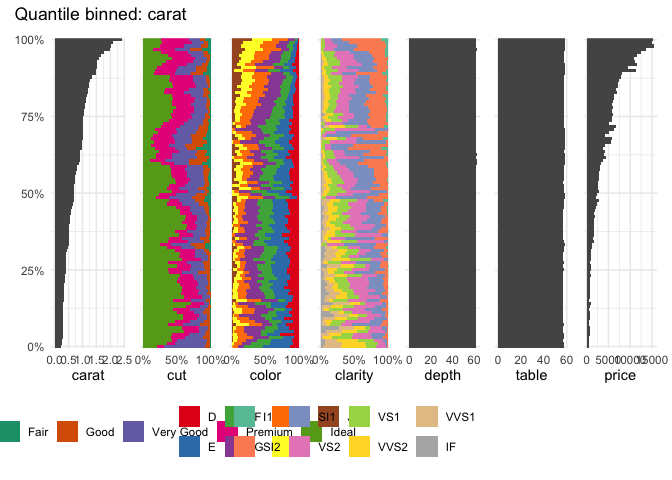
qbin_boxplot(diam, "carat")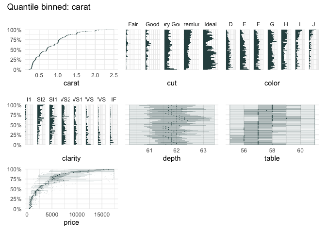
funq_plot(diam, "carat")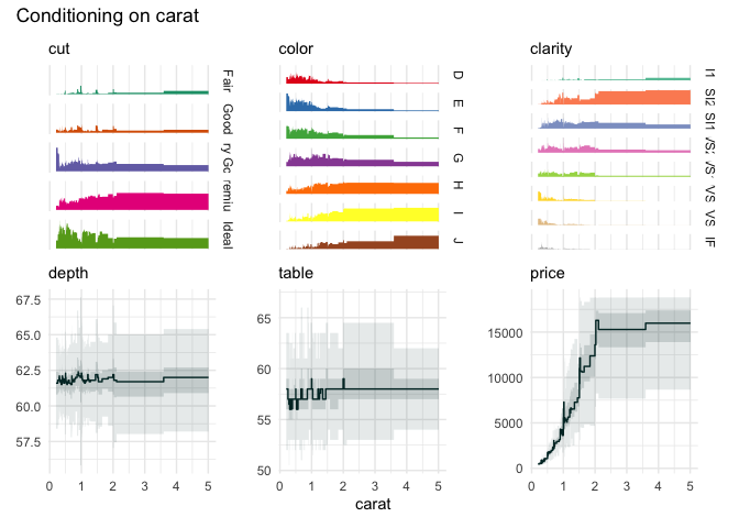
We can zoom in on the carat variable, because the upper quantile bins are not very informative.
qbin_heatmap(
  iris,
  x = "Sepal.Length",
  n = 12,
  type="s"
)
qbin_heatmap(
  iris,
  x = "Sepal.Length",
  overlap = TRUE
)