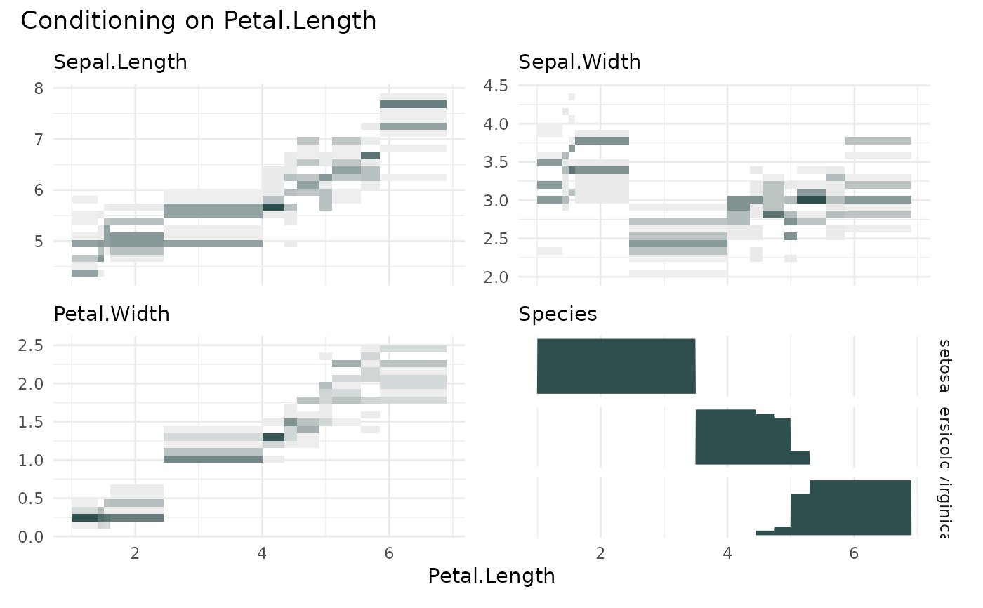
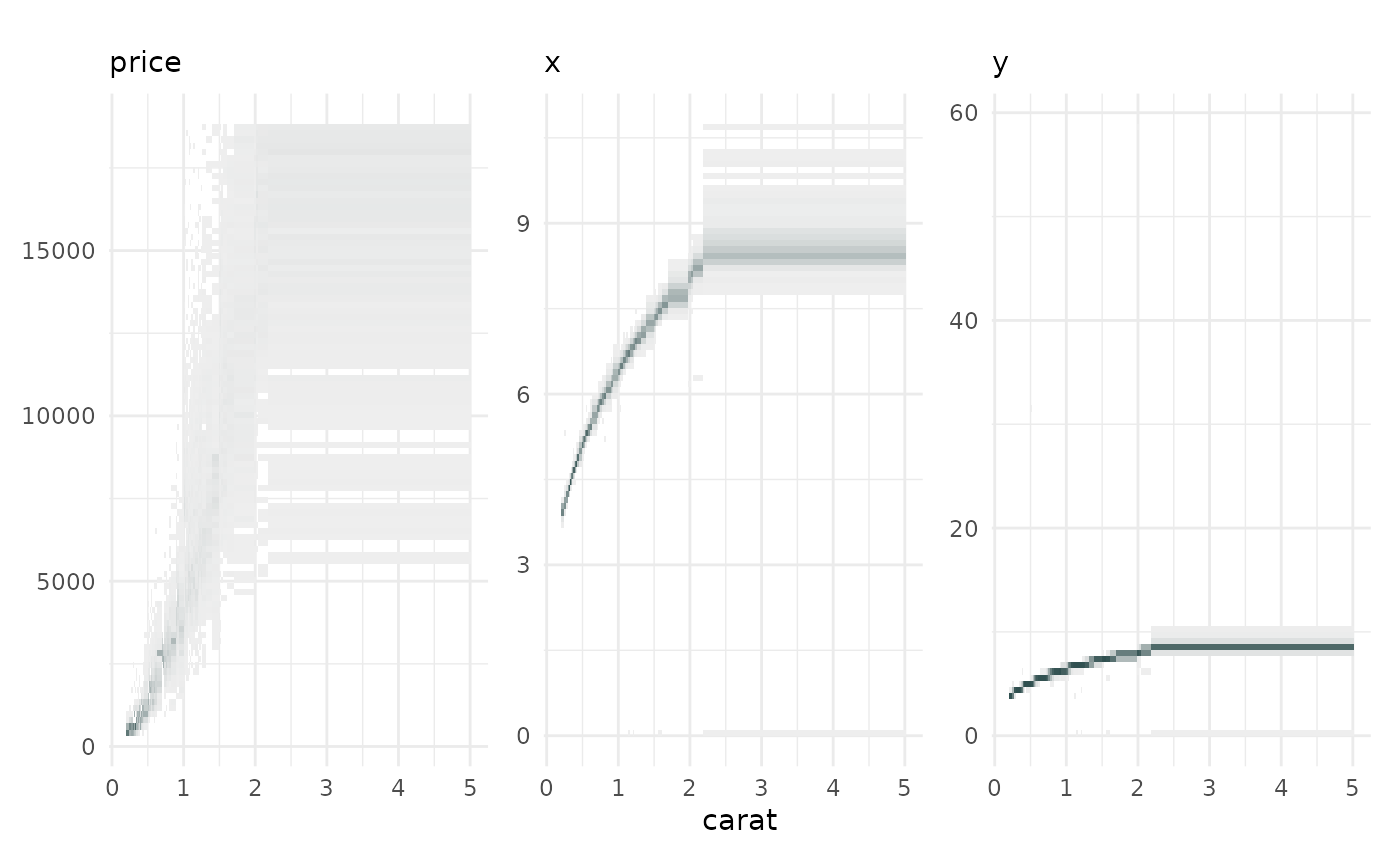
cond_heatmap shows the conditional distribution of the y
of variables for each quantile bin of x. It is an alternative to
cond_boxplot(), fine graining the distribution per qbin().
cond_barplot() highlights the median/mean of the quantile bins, while
funq_plot() highlights the functional dependency of the median.
cond_heatmap(
  data,
  x = NULL,
  n = 100,
  min_bin_size = NULL,
  overlap = NULL,
  bins = c(n, 25),
  ncols = NULL,
  auto_fill = FALSE,
  show_bins = FALSE,
  fill = "#2f4f4f",
  low = "#eeeeee",
  high = "#2f4f4f",
  ...
)
Arguments
- data
a
data.frameto be binned- x
charactervariable name used for the quantile binning- n
integernumber of quantile bins.- min_bin_size
integerminimum number of rows/data points that should be in a quantile bin. If NULL it is initiallysqrt(nrow(data))- overlap
logicalifTRUEthe quantile bins will overlap. Default value will beFALSE.- bins
integervector with the number of bins to use for the x and y axis.- ncols
The number of column to be used in the layout.
- auto_fill
If
TRUE, use a different color for each category.- show_bins
If
TRUE, show the bin boundaries on the x-axis.- fill
The color used for categorical variables.
- low
The color used for low values in the heatmap.
- high
The color used for high values in the heatmap.
- ...
Additional arguments to pass to the plot functions
Value
A list of ggplot objects.
See also
Other conditional quantile plotting functions:
cond_barplot(),
cond_boxplot(),
funq_plot()